
Writing / AI-assisted design
Prompt Engineering for UIPart 02
- Figma
- Prompt Engineering
- Artificial Intelligence
- Design Systems
- UI Design
- AI-assisted design
Prompt engineering for UI: how I made Figma Make follow one visual style across 30+ screens
The iteration workflow I used to fix oversized references, dark-mode drift, and inconsistent styling before scaling screen generation.

Publishing note
“AI-generated conceptual illustration by the author. It does not depict the original product or any confidential interface.”
AI-assistance disclosure: This story and images generated was written with assistance from an AI writing program. The project experience, decisions, observations and original prompts are mine.
Confidentiality and visual-disclosure note: I cannot share the original project name, screens, design references or internal assets. Project-specific information has been redacted, and every visual in this article is a conceptual reconstruction created only to explain the process.
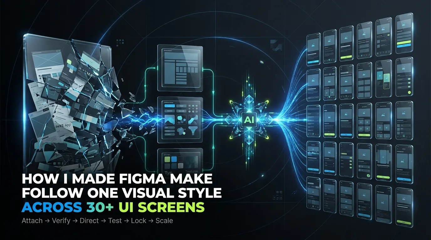
The iteration workflow I used to fix oversized references, dark-mode drift and inconsistent styling before scaling screen generation.
Screen generation was only the first milestone
In my earlier workflow, I finally managed to make Figma Make generate UI screens instead of blank frames and incomplete layouts.
That felt like success.
But when I looked at the screens as a UI designer, they were not ready.
They were good enough for:
- Presenting an early concept
- Explaining a user journey
- Creating a mid-fidelity direction
- Helping a product manager visualise an idea
But they were not consistent enough for a complete UI project.
The visual tone was still unstable. Some screens looked generic. Some design references were interpreted too literally. In one experiment, the interface moved towards dark mode simply because several inspiration screens used dark backgrounds.
I realised that screen generation and UI direction are two separate problems.
The first challenge was:
- Can Figma Make create the screens?
The second challenge was:
- Can I teach it to create all those screens in one controlled visual language?
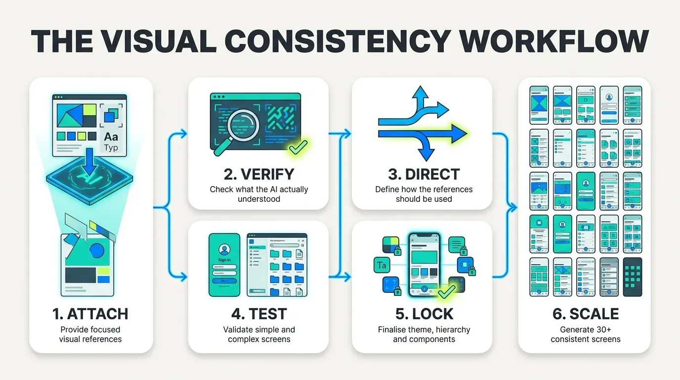
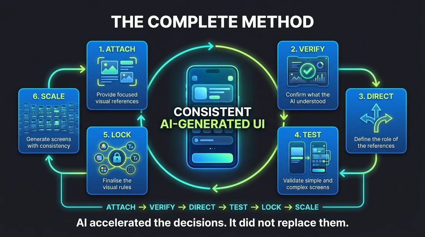
That second challenge became a six-stage workflow:
This article explains how I used that workflow before generating more than 30 screens.
1. I started by giving Figma Make my design inspirations
Once the first screens were generated, I returned to the design inspirations I had already shared with the AI platform.
Figma Make has a useful advantage: a designer can copy a frame from a Figma Design file and paste it directly into the prompt context. Figma also supports attaching designs and images to guide generated layouts, colours and positioning, although the generated result may differ from the original reference. [1]
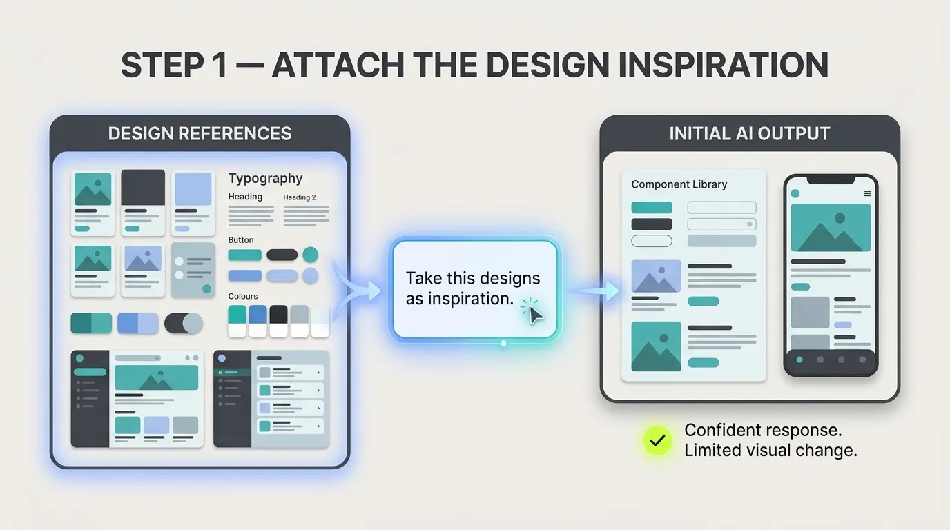
My first instruction was extremely simple.
The instruction I gave Figma Make
PROMPT
Take this designs as inspiration.
Figma Make responded:
FIGMA MAKE / RESPONSE
Reasoning >
What this instruction was doing
“Take this designs…”
This pointed Figma Make towards the attached visual references instead of asking it to invent a visual language.
“…as inspiration.”
This was supposed to clarify that the references were not wireframes or functional requirements. They existed only to influence the visual direction.
What happened after I gave the instruction
Figma Make appeared to understand the request.
It responded confidently and said it would improve the component library.
But the actual UI did not change as much as I expected.
That difference between the confidence of the response and the quality of the output became my first important lesson:
An AI saying it understands a reference does not prove that it has processed the reference properly.
2. One oversized inspiration frame was the real problem
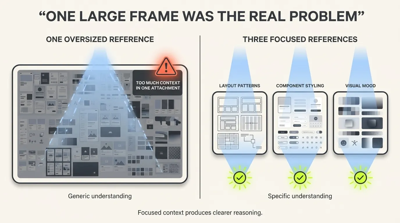
All my design inspirations were placed inside one very large Figma frame.
I copied that complete frame and pasted it into Figma Make.
During the process, Figma Make showed a warning indicating that the attachment or selection was too large.
At first, I ignored that warning because the system still responded to my prompt.
That was the mistake.
Figma’s troubleshooting guidance explains that very large attached designs can be converted into images or fail to process properly. It recommends selecting smaller parts of the design, dividing large references into multiple smaller frames and adding those smaller frames separately. [2]
So I changed my approach.
I divided the inspiration board into three smaller frames and pasted those three frames separately.
Then I wrote:
PROMPT
For your better understanding these are the design inspirations.
This time, Figma Make responded differently:
FIGMA MAKE / RESPONSE
Reasoning >
Perfect! I now have a complete understanding of the design inspirations. These show a telecom subscription/OTT platform with several key patterns:
The response was more specific. It started identifying actual patterns instead of only promising to “enhance” the interface.
What this prompt was doing
“For your better understanding…”
This acknowledged that the first attachment had not communicated the references clearly enough.
“…these are the design inspirations.”
This re-established the purpose of the three smaller frames. They were visual references — not feature requirements, content sources or new screen structures.
What happened after I gave the instruction
The reasoning became more detailed, and the output started reflecting the inspiration more clearly.
The biggest change was not the sentence I wrote.
The biggest change was the quality and size of the context attached to that sentence.
The lesson
Do not only ask:
Did the AI respond?
Ask:
Did its response prove that it understood the visual patterns?
A generic promise such as “I will improve the design” is not enough.
A stronger understanding response should identify things like:
- Layout patterns
- Component treatments
- Visual hierarchy
- Colour relationships
- Shape language
- Content density
- Possible directions
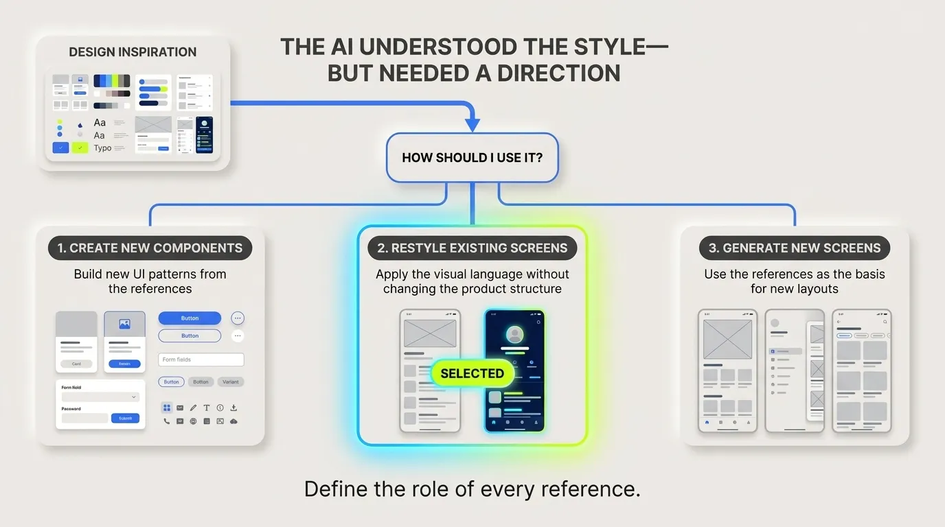
3. Figma Make understood the inspiration — but did not know what to do with it
After analysing the smaller frames, Figma Make did something smart.
It did not immediately change everything.
Instead, it presented three possible directions:
- Create new components based on these patterns
- Update existing screens to match this style more closely
- Build specific screens based on the inspiration
That question exposed an important ambiguity in my earlier instruction.
“Use this as inspiration” can mean several things:
- Copy the structure
- Create similar components
- Apply only the visual style
- Generate entirely new screens
- Change the existing design system
- Use the references only as mood direction
Figma Make could see the references, but it did not know which role those references should play.
I selected Option 2:
Update existing screens to match the style.
Why I selected Option 2
I did not want the inspiration screens to define:
- My product architecture
- My component requirements
- My screen hierarchy
- My content
- My user flow
I already had wireframes and a design-system direction.
The inspirations were only for:
- Look and feel
- Visual polish
- Card treatment
- Spacing
- Depth
- Hierarchy
- Interaction character
What happened after I selected the direction
Figma Make started applying the visual style to my existing screens.
The output improved significantly.
But then a new problem appeared.
Because some references used dark mode, Figma Make moved the entire interface towards dark mode.
The lesson
Whenever you attach a visual reference, define its role.
Tell the AI whether the reference is for:
- Structure
- Components
- Interaction
- Content
- Branding
- Visual styling only
Otherwise, it may choose the wrong interpretation while still producing something visually impressive.
4. The UI improved — but drifted into dark mode
The visual adaptation was good.
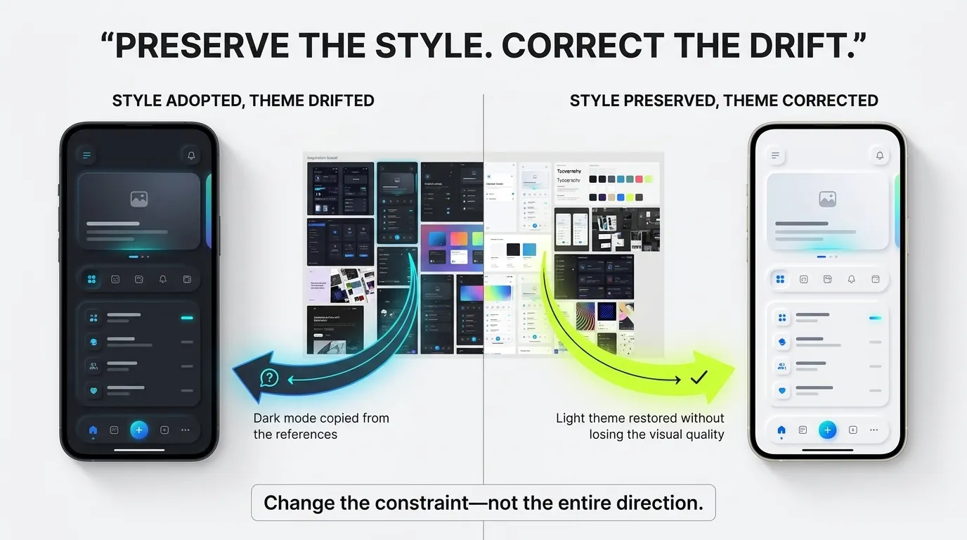
However, Figma Make had adopted more from the inspiration than I intended.
Several reference screens were dark, so it redesigned the product in dark mode.
Instead of rejecting everything and starting again, I preserved the successful part and corrected only the wrong part.
The instruction I gave
PROMPT
Very nice adaptation on Subscription Page. But I’m designing [PROJECT].
Also it shouldn’t be in Dark mode.
Now make the Sign IN, File Manager, Internal Storage and Cloud Storage in same manner.
Line-by-line prompt explanation
“Very nice adaptation on Subscription Page.”
This told Figma Make that the visual adaptation itself was successful.
I did not want it to throw away the styling direction.
“But I’m designing [PROJECT].”
This brought the conversation back to the actual product context.
The reference was not the product.
“Also it shouldn’t be in Dark mode.”
This introduced a clear constraint.
The style could remain, but the theme had to change.
“Now make the Sign IN, File Manager, Internal Storage and Cloud Storage in same manner.”
This asked Figma Make to apply the corrected direction to several existing screens.
I deliberately included screens with heavier component usage, because an attractive style is not useful if it only works on one simple page.
What happened after I gave the instruction
Figma Make preserved the overall polish while moving the interface back into a light theme.
This is similar to the follow-up approach Figma recommends: state what should change, how it should change and what should remain the same. Figma also recommends tightly scoped follow-up prompts rather than vague requests to redo everything. [3]
The lesson
Do not say:
This is wrong. Redesign it.
Say:
Keep this successful visual treatment, but change this specific constraint.
That helps preserve the progress you have already made.
5. I established a repeatable working relationship
Once the updated screens looked good, I needed to prepare Figma Make for a much larger production cycle.
I was not creating only two or three screens.
I had more than 30 screens to convert from wireframes into UI.
So I wrote:
PROMPT
Looks good. No I will Give you screens and you will give me UI.
What this instruction was doing
This was not a detailed design prompt.
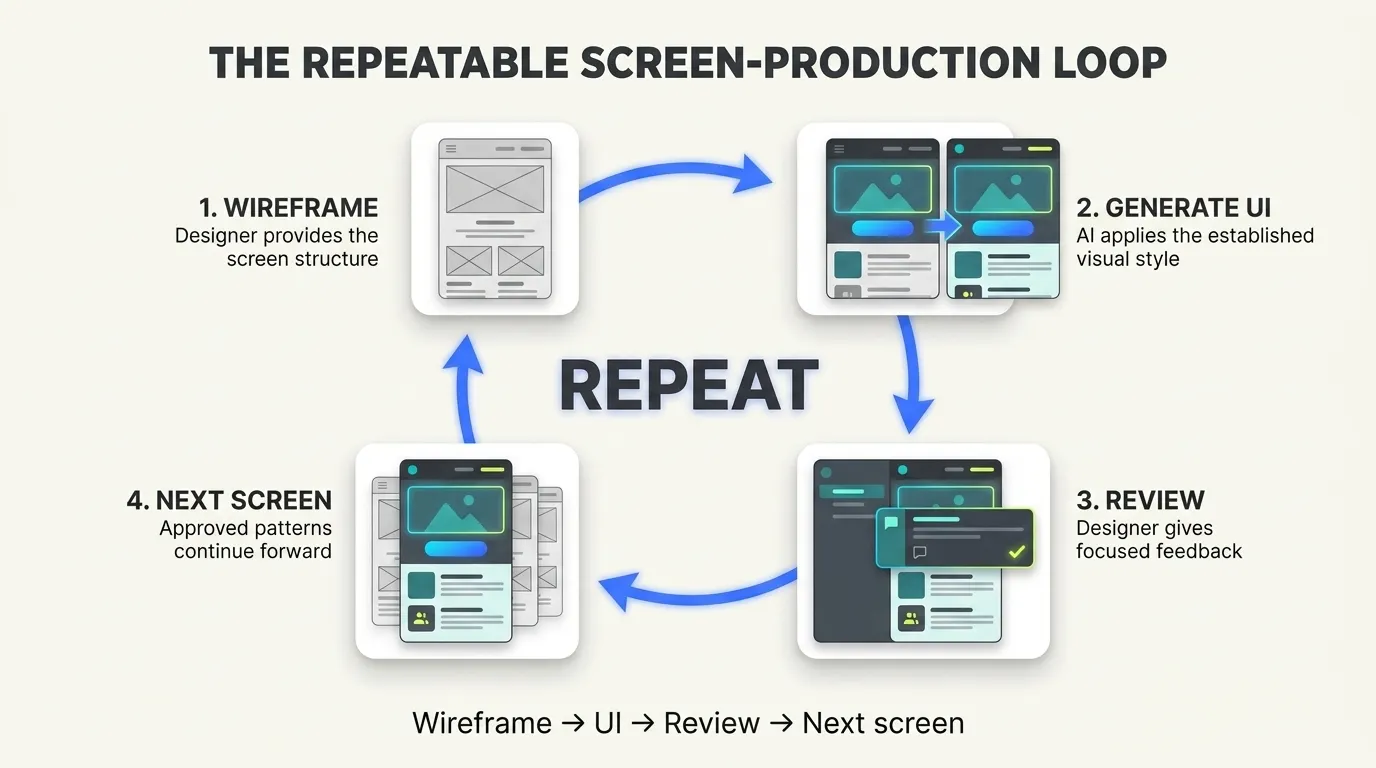
It established an operating rhythm:
- I provide a screen or wireframe
- Figma Make interprets it
- Figma Make applies the established style
- I review and refine it
- We move to the next screen
Figma Make responded:
FIGMA MAKE / RESPONSE
Go ahead and share the first screen!
At this stage, it was ready for wireframe input.
However, before beginning full production, I found additional design inspiration.
I decided to add that inspiration immediately rather than changing the design direction after dozens of screens had already been generated.
The lesson
Before scaling, establish the collaboration pattern.
The AI should know:
- What you will provide
- What it should return
- Which visual language it should preserve
- How the review loop will work
6. I gave Figma Make more inspiration — but also more freedom
I found additional design inspiration in Figma.
Since I was still early in the project, it was the right time to introduce it.
I wrote:
PROMPT
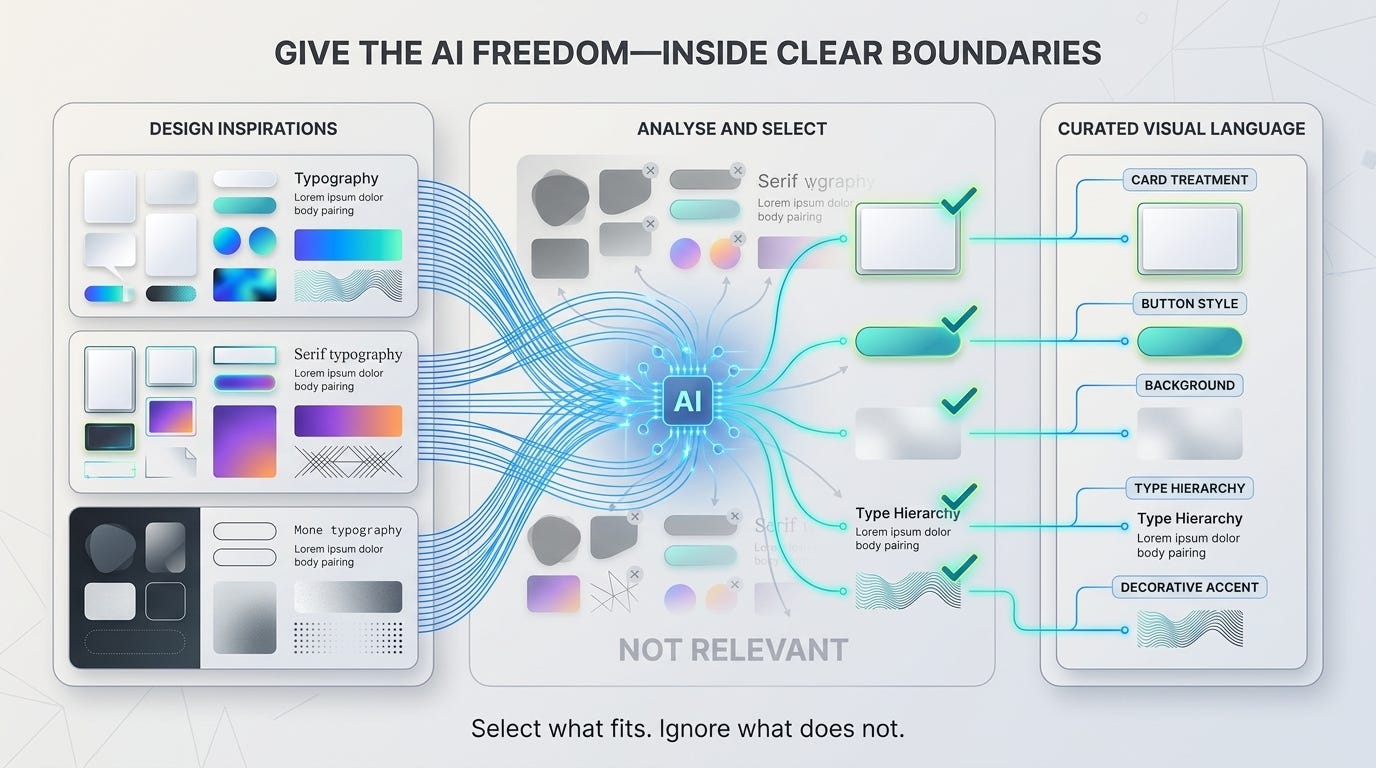
Let me give you some more design inspirations from dribbble. Then you decide which type of elements you want to take.
Why I gave Figma Make freedom
I could have instructed it to copy a particular card, background treatment or component.
But that created a risk.
If I explicitly told it to use one particular element, it might apply that element too frequently — even in screens where it did not belong.
Instead, I allowed Figma Make to analyse the references and decide which visual elements were relevant.
This was not unlimited creative freedom.
The boundaries were already established:
- The product structure came from my wireframes
- The component requirements came from my product
- The theme had to remain light
- The visual direction was already forming
- The new references were only another source of styling cues
What happened after I gave the instruction
Figma Make analysed the new references and identified elements that could be integrated into the existing direction.
At that point, the style was ready to be tested.
The lesson
Give AI freedom inside clearly defined boundaries.
Too little freedom can make the output repetitive.
Too much freedom can make the output inconsistent.
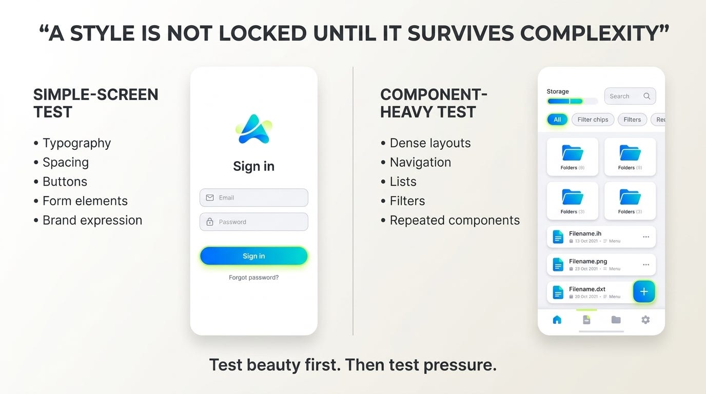
7. I tested the style on a simple screen — and then a complex one
Before applying the style to every wireframe, I tested whether it could survive different levels of complexity.
First, I wrote:
PROMPT
Apply this on Sign in page first
Figma Make responded:
FIGMA MAKE / RESPONSE
Reasoning >
Perfect! I’ve completely redesigned the Sign In screen with inspiration from the Dribbble designs.
The sign-in screen looked good.
Then I wrote:
PROMPT
Looks good. Let’s apply it on the File manager page.
Figma Make responded:
FIGMA MAKE / RESPONSE
Reasoning >
Perfect! I’ve completely enhanced the File Manager screen with modern design elements inspired by the Dribbble designs.
Why I tested the sign-in screen first
A sign-in screen is comparatively simple.
It allowed me to evaluate:
- Typography
- Spacing
- Button treatment
- Form elements
- Brand expression
- Visual hierarchy
Why I tested the File Manager next
The File Manager contained more components and more information.
It tested:
- Dense layouts
- Lists
- Navigation
- Icons
- Storage information
- Repeating components
- Visual hierarchy under pressure
What happened after the two tests
The visual language worked on both the simple and complex screens.
That was when I became confident that it could be scaled.
The lesson
A style is not locked because it looks good on one attractive screen.
It is locked when it still works on a screen containing many components, states and information layers.
8. I corrected one visual rule at a time
The style was almost ready.
I still had some feedback, but I did not send all the feedback in one long instruction.
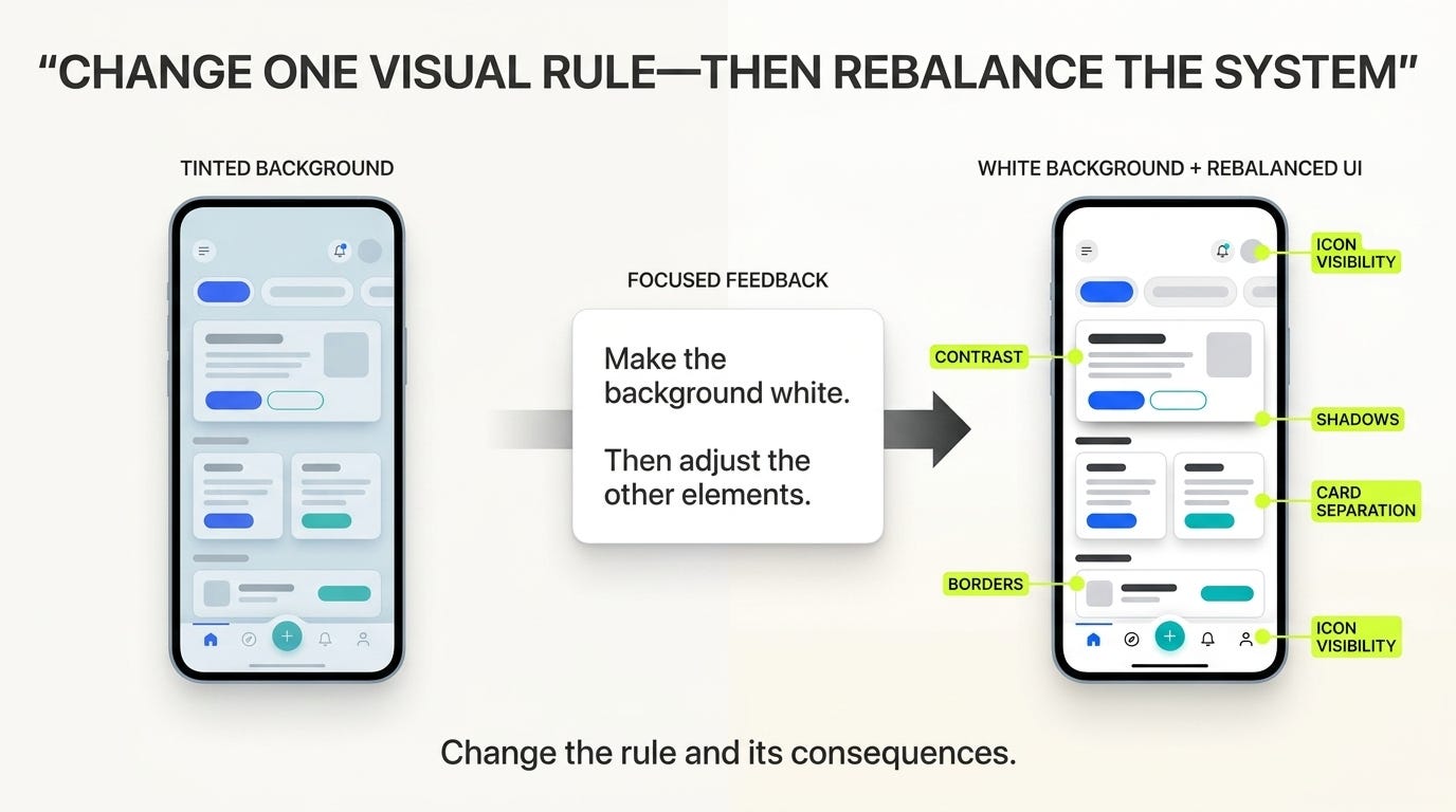
I started with one major visual rule: the background.
PROMPT
Looking very nice. We are almost there to generate all the screens. Just one thing. Can we make the background white. And then adjust the other elements.
Line-by-line explanation
“Looking very nice. We are almost there…”
This preserved the current direction and communicated that the system was close to the expected result.
“Just one thing.”
This reduced the scope of the change.
“Can we make the background white.”
This introduced the main correction.
“And then adjust the other elements.”
Changing the background affects:
- Contrast
- Shadows
- Borders
- Card separation
- Text hierarchy
- Icon visibility
- Accent intensity
I did not want Figma Make to change only the background layer while leaving every dependent element untouched.
What happened after I gave the instruction
Figma Make changed the background to white and rebalanced the surrounding elements.
This approach closely matches Figma’s recommendation for follow-up prompts: keep the request tightly scoped, explain what should change and avoid combining unrelated edits. [3]
The lesson
Make one visual correction at a time — but mention the consequences of that correction.
Do not only say:
Make the background white.
Say:
Make the background white, then adjust the other elements for the new contrast and hierarchy.
9. I told Figma Make what the screens would eventually become
Once the visual direction was ready, I gave Figma Make a longer-term plan.
PROMPT
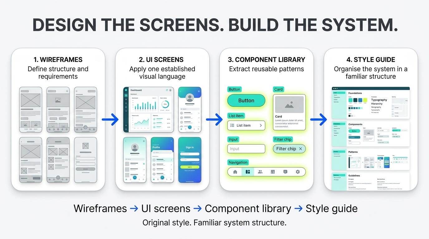
Perfect. Now I will give you wireframes one by one , with this style I would like the generate UI of that wireframe. And after all the wireframe converting to UI, I would like to create a component library based on the UI you have made. With that component library we will make a style guide similar to google material. Style, color, components will be mine but the structure will be google materials.
Line-by-line prompt explanation
“Now I will give you wireframes one by one…”
This defined the production input.
The AI would not invent the screen structure. It would receive one wireframe at a time.
“With this style I would like to generate UI…”
This connected every future screen to the visual direction we had already tested.
“After all the wireframe converting to UI…”
This explained that screen production was one stage of a larger process.
“I would like to create a component library based on the UI you have made.”
This established the future systemisation goal.
Patterns created across the screens would eventually become reusable components.
“We will make a style guide similar to Google Material.”
The designers and developers who would use the system were already familiar with Material Design’s organisation.
I wanted:
- My own visual style
- My own colours
- My own components
- My own product patterns
But I wanted to organise and document them in a familiar structure.
What happened after I gave the instruction
Figma Make summarised the plan back to me.
That confirmation was important because I was no longer asking it to generate one isolated screen.
I was defining an end-to-end production system:
Wireframes → UI screens → reusable components → structured style guide
The lesson
Before scaling, tell the AI what the outputs will eventually become.
An individual screen can be designed in isolation.
A scalable UI system cannot.
10. Then the wireframe-to-UI production cycle began
Figma Make responded that it was ready and asked me to provide:
- The wireframe image or description
- The screen name and purpose
- Any specific interaction or behaviour notes
Figma Make supports attaching designs, images and PDFs to prompts as context, making it possible to provide visual structure and supporting requirements during generation. [1]
I started attaching the wireframes one by one.
My first inputs were simple:
Welcome & Sign in
Then:
Verify OTP Screen.
Figma Make responded:
FIGMA MAKE / RESPONSE
Reasoning >
Perfect! I’ll convert this Welcome & Sign In wireframe into a polished UI using the established design system.
And then:
FIGMA MAKE / RESPONSE
Reasoning >
I’ll create a polished Verify OTP screen, transforming the wireframe into a modern, interactive UI with the established components and styling patterns.
What happened after
The workflow was now predictable:
- Attach a wireframe
- Name the screen
- Provide behavioural notes if necessary
- Generate the UI
- Review the result
- Give focused feedback
- Approve the pattern
- Continue to the next screen
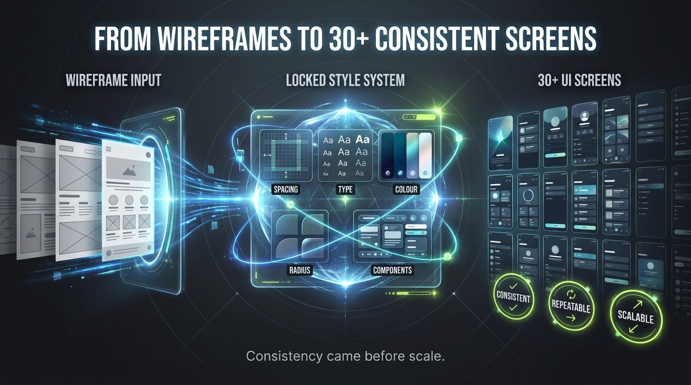
At that point, Figma Make was no longer inventing a new style for every screen.
It was operating inside the direction we had already:
- Attached
- Verified
- Directed
- Tested
- Locked
Now it was ready to scale.
The complete method
The final workflow was not one perfect prompt.
It was a sequence of controlled decisions:
Attach
Give Figma Make focused visual references.
Verify
Read the reasoning and inspect the output to determine whether it truly understood those references.
Direct
Define what role the references should play.
Test
Apply the style to both a simple screen and a component-heavy screen.
Lock
Correct major rules such as theme, background and visual hierarchy before scaling.
Scale
Begin the wireframe-to-UI loop only after the visual system is stable.
What I learned
I initially thought the biggest challenge would be getting Figma Make to generate screens.
It was not.
The harder challenge was teaching it:
- Which parts of a visual reference to learn
- Which parts to ignore
- Whether a reference was for style or structure
- When a visual direction was stable enough to scale
- How to preserve successful decisions while correcting drift
Figma Make did not replace my UI decisions.
It increased the speed at which I could test those decisions.
The screens became consistent only after I treated the AI as a collaborator that needed:
- Context
- Direction
- Boundaries
- Feedback
- Verification
- Approval
— not as a generator that should get everything right from one instruction.
Key takeaways
- Do not attach one enormous inspiration board. Split large references into smaller focused frames.
- Do not trust a confident response alone. Verify understanding through specific reasoning and visible output changes.
- Tell the AI what the reference is for. Style, structure, components and content are different instructions.
- Correct drift without discarding successful work. Explain what should change and what should remain.
- Test the style on different complexity levels. A simple screen is not enough.
- Give one focused correction at a time. Include the related consequences of that change.
- Explain the final destination. Screens that will become a component library should not be treated as isolated outputs.
- Scale only after the visual language survives testing.
References
- [1] Figma Help Center, Attach files to a prompt in the Figma agent and Figma Make.
- [2] Figma Help Center, Troubleshoot in Figma Make.
- [3] Figma, 7 tips for using Figma Make credits more efficiently.
- [4] Google AI for Developers, Imagen prompt guide.
- [5] Google AI for Developers, Gemini image-generation prompting guide.
- [6] Medium Help Center, Artificial Intelligence content policy.
Reader conversation
Discussion
0 responsesBe the first to respond.